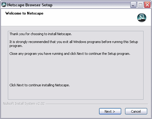
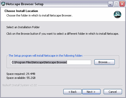
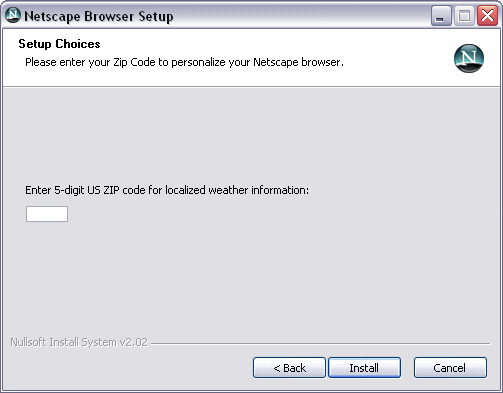
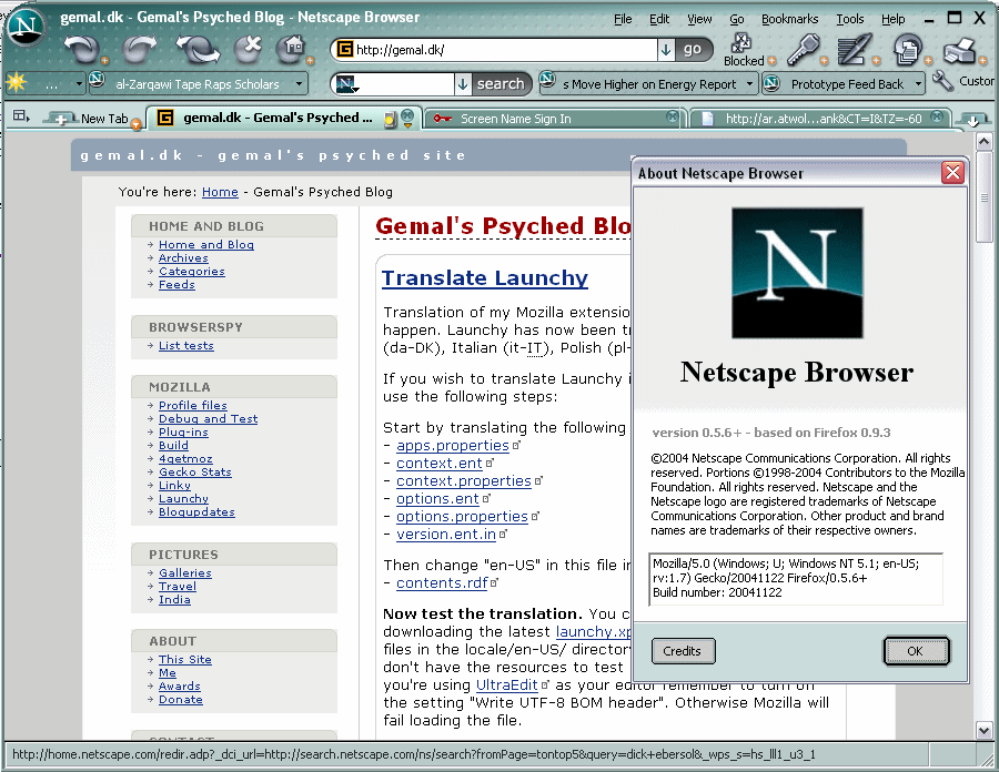
Netscape Browser Screenshots
First with screenshots of the new Netscape Browser:
http://gemal.dk/misc/nsb01.png
http://gemal.dk/misc/nsb02.png
http://gemal.dk/misc/nsb03.png
http://gemal.dk/misc/nsb04.png
http://gemal.dk/misc/nsb05.png
http://gemal.dk/misc/nsb06.png
http://gemal.dk/misc/nsb07.png
http://gemal.dk/misc/nsb08.png
http://gemal.dk/misc/nsb09.png
http://gemal.dk/misc/nsb10.png
http://gemal.dk/misc/nsb11.png
http://gemal.dk/misc/nsb12.png
http://gemal.dk/misc/nsb13.png
http://gemal.dk/misc/nsb14.png
http://gemal.dk/misc/nsb15.png
You can read more about the prototype here.
Ads:
 |
 |
45 Comments
#5 - the actual browser (chrome and widgets) look very bad in my opinion. Almost cartoon-ish.
I'll stick with Safari and Firefox. ;)
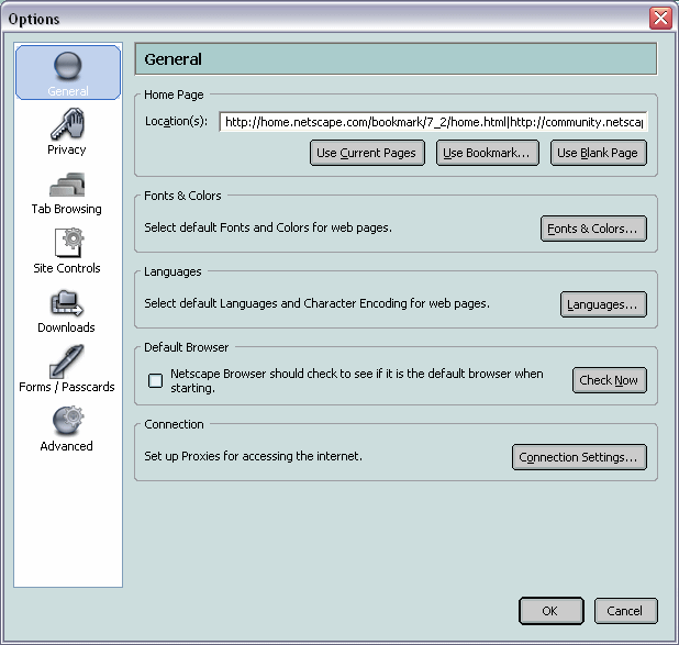
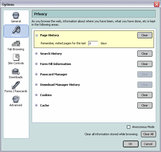
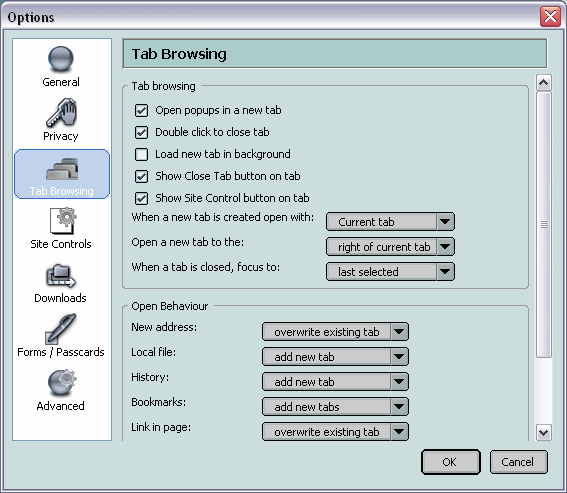
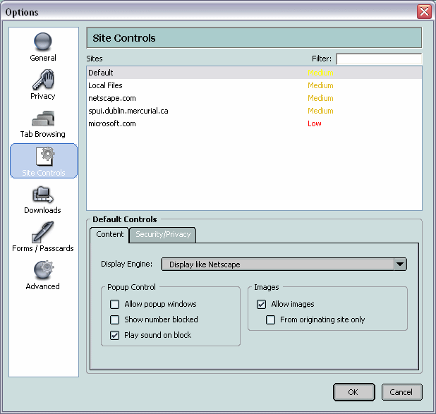
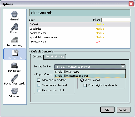
I dont know about you guys, but I like the way they slightly re-organized the options panel... tab options are more discoverable with their own tab on the panel, and the per-site options look cool. However it is SO UGLY.
Comment by Jason Lustig at November 30, 2004 07:24 PM | Permalinkthe tabbed browsing options look nice. don't know about the rest of it though.
Comment by chob at November 30, 2004 07:24 PM | PermalinkI am playing around it now. The recent Netscape themes are always too dark, not eye candy at all. The two running news are not really enough space.
I like the switch of rendering engine -- it help me to do web design. I hope it update to latest firefox engine and can update theme.
Per-site options is great, though the Netscape implementation is very limited. From what I can gather from the screenshots it is not possible to have per-site stylesheets.
Switching of rendering engines is a very useful option and some will switch to Netscape because of this.
But the interface looks like a merge between Netscape 7 and Firefox and is extremely unattractive. Hopefully it will get better, and I hope this browser will be a success.
Why? Less people browsing with IE.
I think it looks really ugly but the idea is quite good. I linked to here in a ./ comment. Sorry, I didn't really think it though. Your server seems to be quick at the moment though, if it starts to slow up I can mirror the images.
Comment by Jon at November 30, 2004 08:41 PM | PermalinkIf you try to input a Zip Code that begins with a zero for the weather ticker, it drops the zero and gives an 'undefined' message in the weather spot. Priceless!
switching between Gecko and IE will never work in practice.
Comment by Bob at November 30, 2004 09:32 PM | PermalinkSpace REquired: 29.4MB? Apparently it has a kitchen sink mode as well.
The Book of Mozilla seems to have gone in the netscape beta.
By editing some config settings in about:config, it is possible to install some Firefox extensions in Netscape browser. I just installed Googlebar without problems. Installing the Qute theme was less successful however:
http://img65.exs.cx/img65/2686/screwedns.jpg
Installing the Web Developer toolbar required me to launch Netscape in safe mode and uninstall. Config settings to edit are just changing app.id to the Firefox one and app.version to 0.9.3.
Ouch it really doesn't look good ... too much crap that i don't use on daily basis ... I do like the "go" and "search" buttom tho.
Besides appearance, everything else's working fine for me
Some stupid bug tho. Under theme manager the default theme's name is still "Firefox (Default)
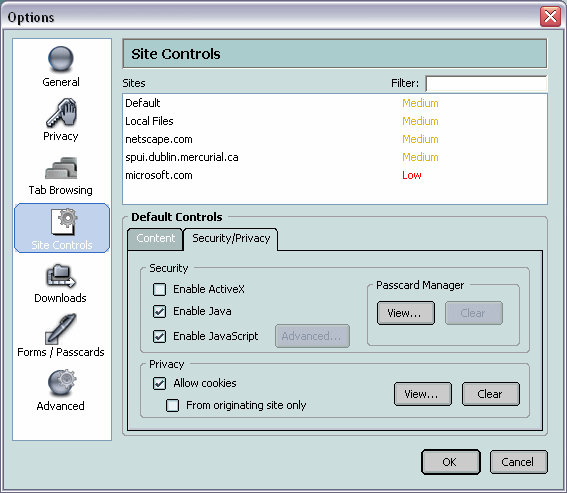
Comment by jayfromtaiwan at November 30, 2004 10:23 PM | PermalinkI also like the per-site options. I think this approach is more logical than the way it is done in Firefox where the options are function-centric rather than site-centric. I think the cookie settings should be specified here as well (perhaps that's what's on the second tab?)
The options interface is really nice. Even mozilla suite's is better than Firefox's though.
Comment by janurary girl at December 1, 2004 12:05 AM | PermalinkBTW, I see a customize button. If this browser is customizable as Firerox, I wil use it. THe thing I hate about mozilla suite is tha tuncustomizable toolbars, otherwise I'd use it.
Comment by jangirl at December 1, 2004 12:08 AM | Permalinkhttp://spui.dublin.mercurial.ca/
Looks like they have some (rarely-updated) Livemarks, eh?
I agree that some of the added options seem like nice ideas, and that it looks positively hideous...
Comment by painc at December 1, 2004 12:52 AM | PermalinkReally, really, really ugly.
Even if they want to stick with the greenish Netscape theme, they should try to make it less... ugly.
Nice features though...
Comment by Rith at December 1, 2004 01:01 AM | PermalinkNot only is the theme really ugly, but the whole browser defeats the simplicity that made Firefox successful. All those toolbars, buttons, drop-down boxes, they just clutter up the user interface, and few of them are ever used...
The interface is way too crowded for my tastes. Plus the green looks ugly. I love Firefox's understated look. The more real estate provided for actual broswing the better. They should take a look at how some of the extensions make Firefox look and build on that.
![[TypeKey Profile Page]](http://gemal.dk/nav-commenters.gif) at December 1, 2004 05:08 AM | Permalink
at December 1, 2004 05:08 AM | Permalink
The design is hidious. No one will use it simply because it's too hard on the eyes. By that alone, Netscape has already failed. ( K.I.S.S. )
Comment by Circuit_Bend at December 1, 2004 11:23 AM | PermalinkThis feels like Ralph Nader. It's taking away votes from the better candidate (Firefox) and allowing the other guy (IE) to win.
Parameters seems TOO compplicated and keeps the stupid "security zone" concept from IE.
And the gray colours are sad like rain on the seaside...
Sorry for my bad French
That is the ugliest thing I have ever seen.
Comment by andrew at December 1, 2004 05:38 PM | PermalinkBig deal, i bet it still suffers from a very severe printing bug that keeps me using internet explorer in the office.
printing bugs have been critical and open since 2002 and not fixed.
https://bugzilla.mozilla.org/long_list.cgi?buglist=154892
Comment by dgtlmoon at December 2, 2004 02:10 AM | PermalinkThat is just such a cluttered main screen. I';m currently running Opera (and very happy with it) and all I have on the main screen are the 8 small buttons on the address bar at the top and my personal bar on the bottom (with my favourite, favourite links in). The new Netscape screen is far, far too busy for general surfing.
I agree that it's way too cluttered and ugly, but you have to remember that some people (even end users) /like/ having that much crap on the screen at once. They believe it's efficient and useful.
gemal.dk - Netscape Browser Screenshots
I don't see what the big deal over Firefox OR netscape is anyway. The real browser that blows away all of the competition is Opera. First to do tabbed browsing, faster than anything. If you want a real browser, use Opera.
Comment by Eddie at December 2, 2004 05:25 PM | Permalinkopera is slow as hell. that's what the big deal with firefox is.
Comment by anonymous at December 2, 2004 07:13 PM | PermalinkCosta Rica Spanish School
Comment by Rancho de Español Spanish School at December 7, 2004 05:00 PM | PermalinkI have no Idea the much baout Internet or Browser. But from the beging, I'm using NETSCAPE like version 4.7 or something like that, I'm talking baout year 1990 or may be less,might be I'm wrong. From that time I'm fallen LOVE with NETSCAPE so NETSCAPE browser is my first choice, and 2nd OPERA. I hate IE that iz bullshit ( sorry for my slang ) so I can say NETSCAPE is the best. like east and west NETSCAPE is the best.
Thanks
Anjaan Ahmed
New York
I have the BETA VERSION
ed2k://|file|Netscape beta 0.5.6 full (no fake) enanosch_argentina.exe|11405304|4f500498fe3402bcdf761dc18b7a24a5|
Is Edonkey Download !
Comment by emi at December 23, 2004 11:40 PM | Permalinkgemal.dk - Netscape Browser Screenshots
Just testing the favicon plugin. Nice idea :)
I know this is not the right place, but the favicon plugin does not work in my blog: http://www.macchianera.net
I follow all the instructions, but anything happens. The debug mode does not tells anything. For Mt-Medic the plugin works.
at January 25, 2005 07:53 AM | Permalink
From: gemal's psyched site
I have been a user of Netscape since version 1, I even remained loyal and really struggled through version 6, I think the new Netscape is great and am looking forward to using it.
Comment by Richard at February 18, 2005 07:51 PM | PermalinkYou silly guys ! Netscape has been using gekko long before Firefox ! onl;y I don't know there has been very little publicity about Netscape 7.2 that I use now and that is very stable ! I think it's great !
Comment by Stefan at March 2, 2005 01:26 PM | PermalinkI think this browser's theme is awesome. Someone should make it for firefox.
I will continue to use firefox as primary browser. In the future though, after netscape gets the extensions i want, I will consider making netscape my primary browser.
SORRY GUYS!
COMMENTS-EMAIL ME AT PINNI3@GMAIL.COM
Comment by Pinni at June 30, 2005 05:48 AM | Permalink
One one hand, it's quite unfair that Netscape takes profit from a project it never really wanted, one the other hand it's ok because AOL really invested much money in developing the Gecko engine, and gave the world a enourmous present, independend from the fact that it let Netscape be destroyed by stupid marketing & business men...
But one thing lets me stay happy: The upcoming Netscape Browser is just a uglified version of Mozilla Firefox, so it at least won't take too much market share from the REAL mozilla browser... ;)